
《Design Systems》系列翻译 08 感知模式 part 1
Chapter 4
Perceptual Patterns
感知模式
In this chapter we’ll discuss how perceptual patterns work and their role in a design system.
在本章中,我们将讨论感知模式如何工作以及它们在设计系统中的作用。
Imagine we both have a house, with the same set of furniture: a table, a few chairs, a bed, and a wardrobe. Even though the furniture is the same, our houses can feel distinctly different: it could be because of the style of the furniture, the materials, colors, textures, the fabric on the bed covers, the style of the ornaments, how we lay out the room, the lighting, or even the music we play inside. I refer to such attributes as perceptual patterns. Because of them, your house might feel like a bohemian lair, and mine like a warehouse.1
想象我们都有一所房子,里面都有一套家具:一张桌子,几把椅子,一张床和一个衣橱。即使家具是一样的,我们的房子也会有明显的不同:可以是因为家具的风格、材料、颜色,纹理,床罩上的织物,装饰品的风格,我们如何布置房间,灯光,甚至我们房子里播放的音乐。我把这些属性称为感知模式。因为他们的存在,你的房子可能感觉像波西米亚的巢穴,而我的感觉像仓库。
Examples of perceptual patterns in digital products include tone of voice, typography, color palette, layouts, illustrations and iconography styles, shapes and textures, spacing, imagery, interactions or animations, and all the specific ways in which those elements are combined and used in an interface. Perceptual patterns are always present, even if they’re not purposefully designed. Even a purely functional tool has an aesthetic.
数字产品中感知模式的例子包括声音的音调、版式、调色板、布局、插图和图标风格、形状和纹理、间距、图像、交互或动画,以及在界面中组合和使用这些元素的所有具体方式。感知模式总是存在的,即使它们不是有意设计的。即使是一个纯粹的功能工具也有一种美感。
Sometimes such qualities are seen as styling or the skin of a product — a layer on top. But to be effective they must live not only on the surface but at the core of the brand, and they should evolve with the product. When effective, perceptual patterns become powerful product differentiators.
有时,这样的特质被视为产品的造型或产品的外表 – 产品最外的一层。但要想发挥作用,他们不仅存在于在表面,还要在品牌的核心,他们应该随着产品的发展而发展。当感知模式发挥作用时,它将成为产品差异化的强大工具。
Perceptual Patterns Help to Express Brand Image
感知模式有助于传达品牌形象。
Products can feel different, even if they belong to the same domain and have similar modules. To write this book I tried dozens of word processors with very similar functionality. Only a couple of them, including the one I’m using now, had the kind of writing environment that helped me focus and be most productive.2 I can describe it as crisp and calm, exhibiting a distraction-free aesthetic with an accent on important things, such as the display of the document outline, or the small circles which turn green as I approach my “writing goal.” This environment is created through a combination of certain patterns, although at a first glance it’s not easy to pinpoint what they are.
产品可以感觉到不同,即使它们属于同一个领域并且具有相似的组成部分。在写这本书的过程中,我尝试了几十个具有功能非常相似的文字编辑器。只有其中的几个,包括我现在使用的那一个,能帮助我集中注意力和最有效率的写作环境。2我可以把它描述为清晰而平静,表现出一种无干扰的美学,强调重要的事情,比如文档大纲的展现方式,或是当我接近我的“写作目标”时变成绿色的小圆圈。这种环境是通过特定模式的组合创建的,尽管乍一看很难确定它们是什么。
Let’s take another example: Spotify. To me it feels warm and personal. What exactly are the patterns that create the ambience of intimacy in this digital music service interface with over 100 million monthly users? As well as the functionality, it’s largely due to the imagery styles, color combinations (particularly the ratio of green to black), the subtle and calm feel of interactions, and the typography choices.3
让我们再举一个例子:Spotify。对我来说,它感觉温暖和个人化。在这款每月超过1亿用户的数字音乐服务界面中,通过哪些模式创造出如此亲密的氛围?除了产品功能之外,很大一部分受到图片素材样式的影响,颜色组合(特别是绿色与黑色的比例),给人以微妙和舒缓是交互方式,以及排版的方式。
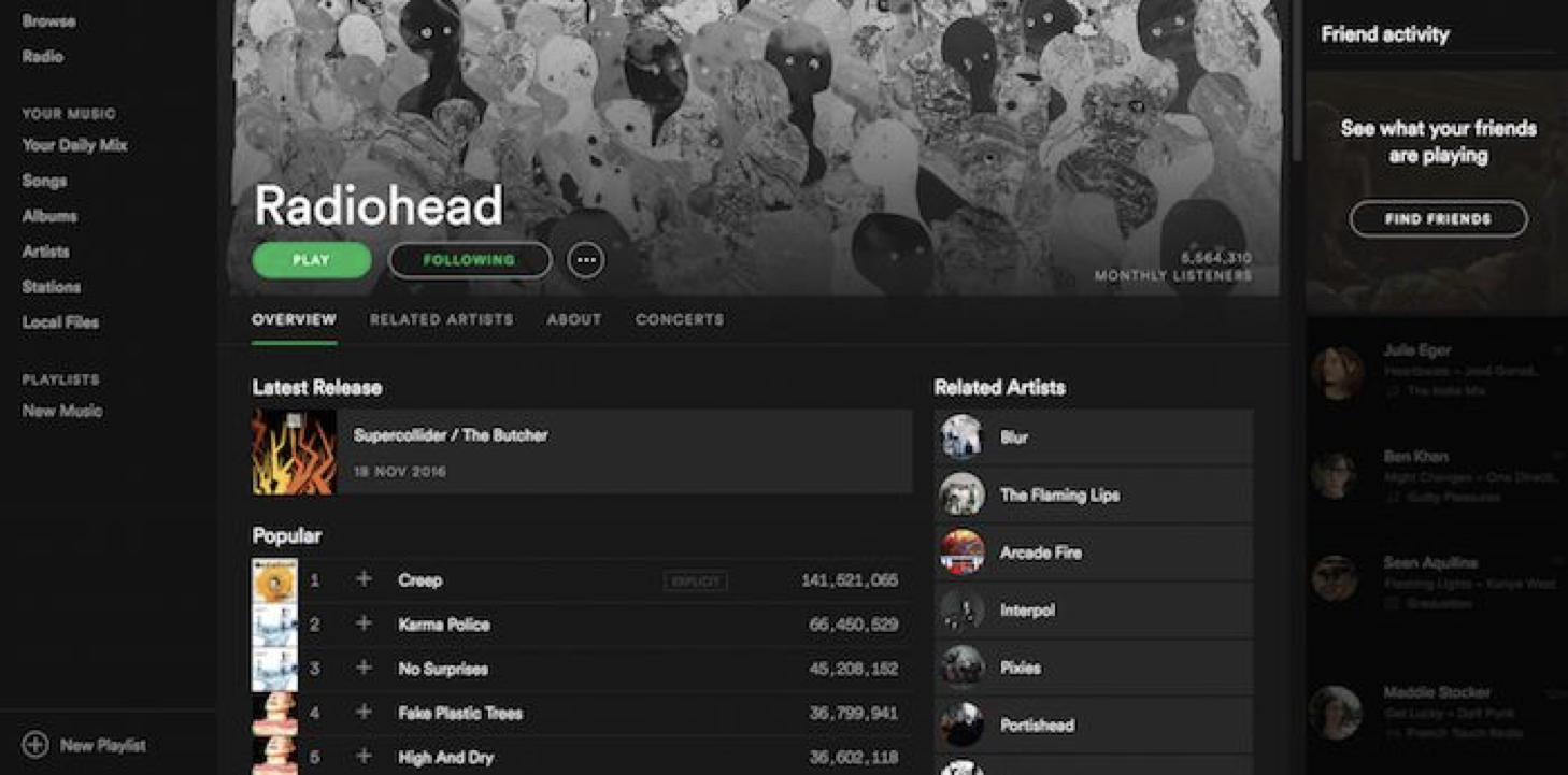
The ambience of intimacy on Spotify is the result of a combination of perceptual patterns, such as subtle interactions, subdued imagery and color accents.
在Spotify中的亲密氛围是一系列感知模式的结合,如微妙的交互方式,柔和的图像和强调色的结果。
On the other hand, the playful, creative, openly enthusiastic and slightly offbeat character of Smashing Magazine is conveyed through a different set of patterns — from the bold color palette and illustrations, down to the smallest details, such as a slight angle on some of the interface elements.
另外一个例子,“smashing”杂志则通过不同的一套设计模式,传达出好玩的、有创造性的、热情奔放的产品调性--从大胆的配色方案和插图,到最小的细节,比如一些界面元素的细微角度。
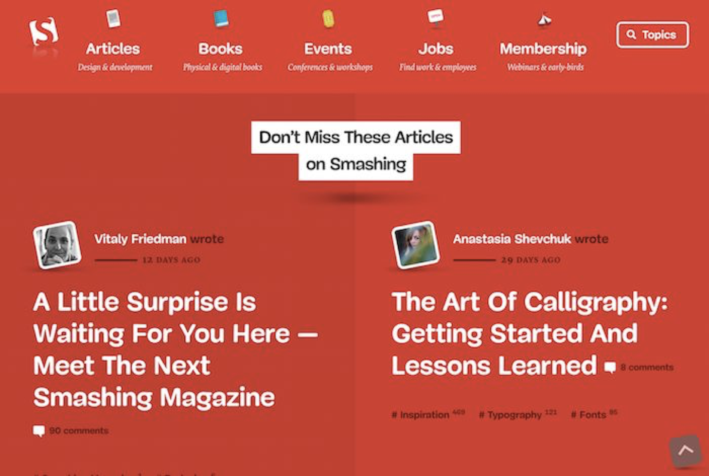
The character of Smashing Magazine is conveyed through a variety of perceptual patterns — from typographic treatments to the playful angle of the images and icons.
杂志的调性是通过各种感知模式来传达的--从排版处理到图像和图标的有趣角度。
Perceptual patterns express the brand through the interface and help to make it memorable. Take a look at the images below: can you recognize which products they represent?
感知模式通过界面来宣传品牌,并使其令人难忘。看看下面的图片:你能认出他们所代表的产品吗?
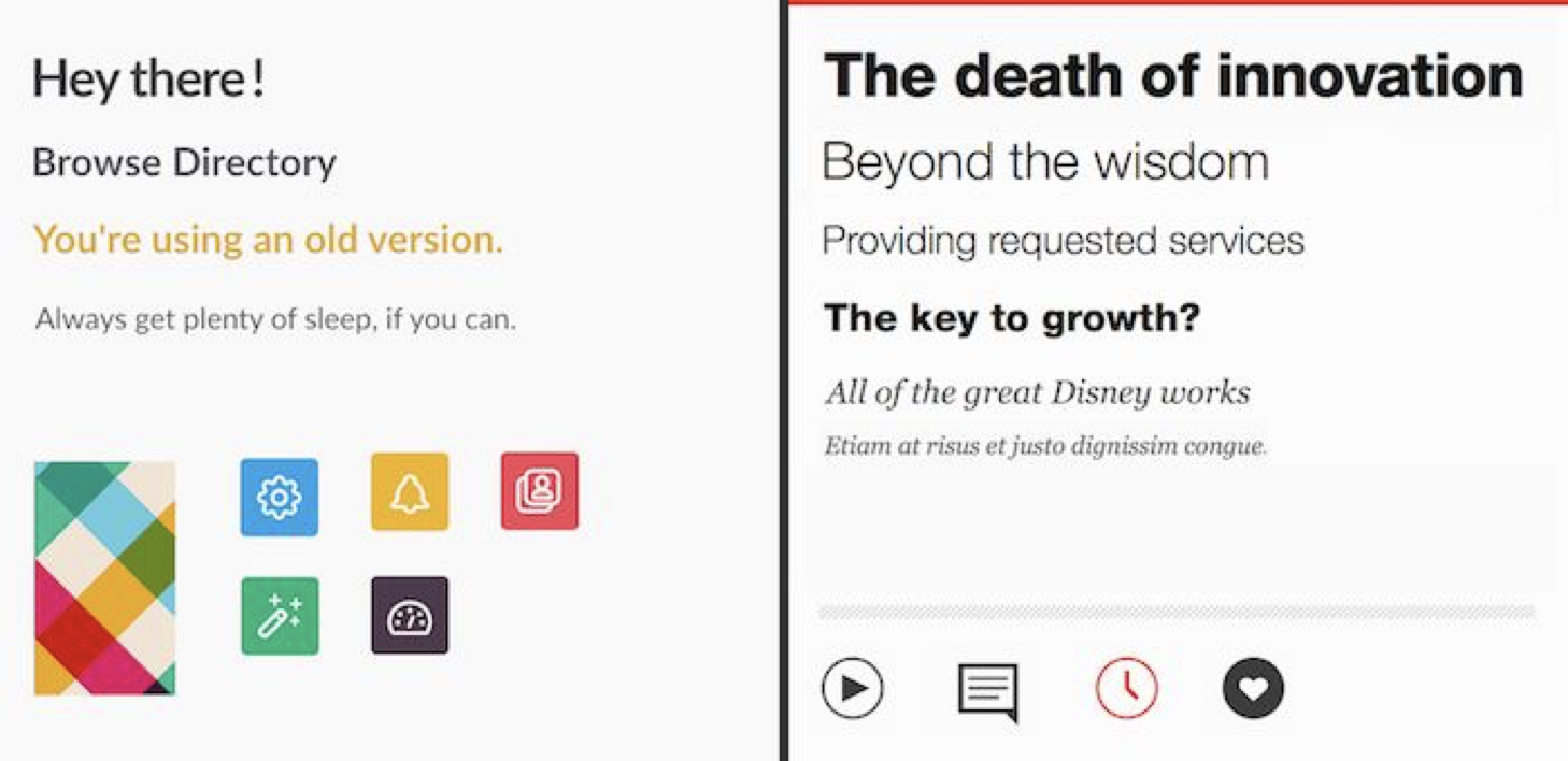
Can you recognize which products these two images represent?
你能认出这两张图片所代表的产品吗?
There isn’t a lot of information in these images: typography styles, some shapes and colors, and a few icons. But those visual cues are so distinct that you might still have been able to recognize which products they belong to (Slack and TED). By being applied purposefully and repeatedly, they form patterns, which is why we can recall and associate them, even when those patterns appear out of context.
这些图像中没有太多的信息:排版风格,一些形状和颜色,以及一些图标。但是这些视觉线索是如此的清晰,以至于你可能仍然能够识别出它们属于哪种产品(Slack和TED)。通过有目的地反复蕴意哦那个,它们形成了模式,这就是为什么即使这些模式出现在产品之外时,我们仍可以回忆并关联它们。
Perception is influenced not only by the building blocks such as color palette and typeface, but the relationships between them. It’s not enough to use headings and colors across the modules consistently. We should also be aware of the unique proportions and combinations that make the product feel a certain way. How do the colors relate to one another? How does the imagery relate to the typography? How does the typography relate to the spacing?
感知模式不仅受到诸如配色板和文字的影响,而且还受到它们之间的关系的影响。在各个模块中使用同样的标题和颜色是不够的。我们也应该意识到可以通过恰当的比例和组合可以使产品传递出不一样的感觉。颜色之间是如何彼此作用的?图像与版式有什么关系?版式与间距有什么关系?
¥¥¥¥ -0626
Michael McWatters, UX architect at TED, shared in an interview how important it is for TED’s brand that the color red appears in the right proportions: “Red should be used sparingly and thoughtfully. Use it in the wrong places, or too much, and it doesn’t feel like TED anymore.”
TED的UX架构师MichaelMcWatters在一次采访中分享了红色在TED品牌中的重要性:“红色应该谨慎使用。在错误的地方使用它,或者使用太多,感觉不再像TED了。“。
Perceptual Patterns Connect the System
感知模式融合到系统
In modular systems, achieving visual coherence and seamlessness can be tricky. Modules are created by different people for different goals. Since perceptual patterns permeate through different parts in the system, they connect the parts. When the connections are effective, users perceive the unity that links the modules together.
在模块化系统中,实现视觉一致和统一是很棘手的。模块是由不同的人为不同的目标创建的。由于感知模式贯穿于系统的不同部分,所以它们相互联系。当模块有效的组合在一起的时候,就会带给用户融为一体的感觉。
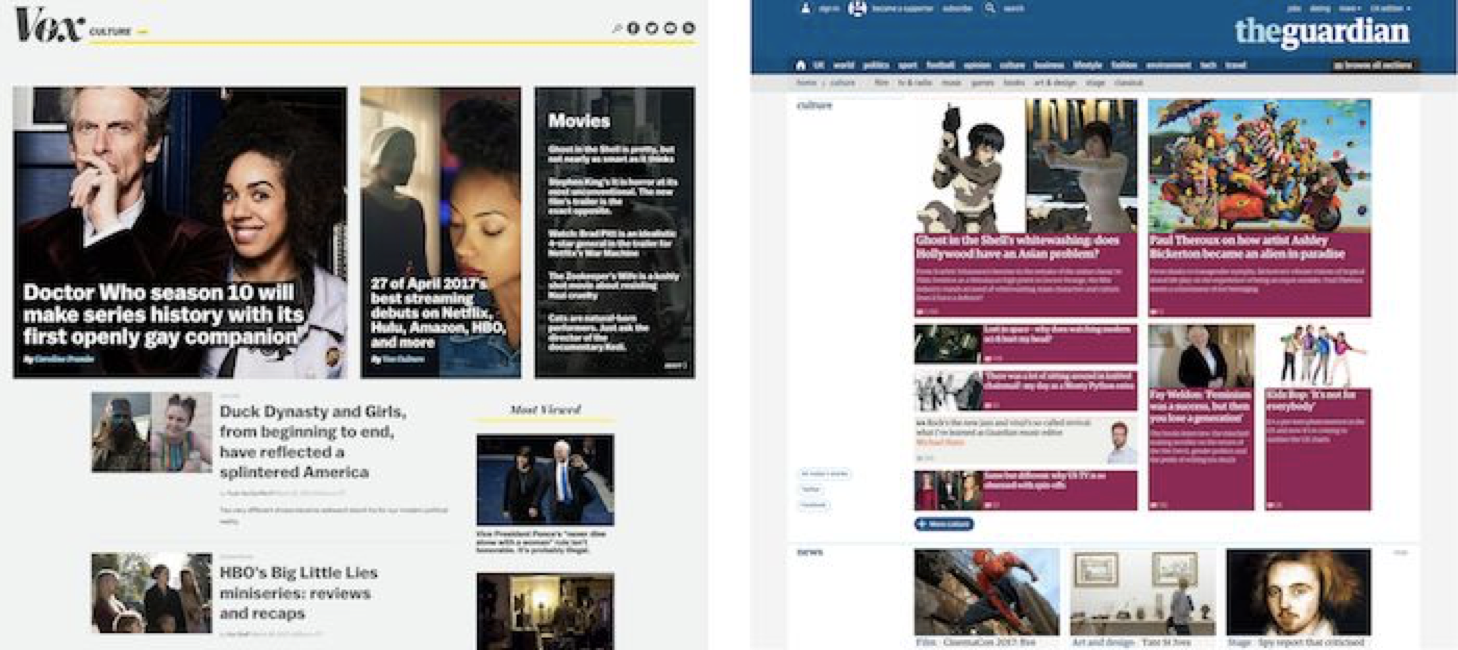
Look how Vox and the Guardian apply perceptual patterns to bring together different elements, integrating them in a cohesive whole. At Vox, eye-catching imagery overlaid with large headings, crisp typeface pairings and generous white space all come together to convey the feeling of a lifestyle magazine under the Vox banner — it’s spacious, informal and perhaps even a little rebellious. In contrast, typography, spacing, imagery and color in the Guardian create a denser, more credible feel, more fitting for a source of serious journalism and opinion.4
看看Vox和“卫报”是如何运用感知模式将不同的元素结合在一起,并将它们整合成一个整体的。在Vox,醒目的图片加上大字标题、清晰的字体搭配和宽敞的空白,都能传达Vox旗帜下一本生活方式杂志的感觉--它宽敞、随意,甚至可能有点叛逆。相比之下,“卫报”的版式、间距、图像和颜色更密集、更可信,更适合成为严肃新闻和舆论的来源。
Connections can be made not only between the modules but across different platforms and contexts. Platform-specific standards such as material design take quite an authoritative view on how patterns should be designed and built. When companies follow native platform conventions strictly, they are very much reliant on perceptual patterns to make the product feel like part of the same brand.
感知模式的关联不仅可以连接模块之间,还可以跨不同的平台和场景。诸如类似Material design这种平台级标准,以权威级的角度决定应该如何设计和构建感知模式。当公司严格遵循本地平台惯例时,感知模式在使产品感觉像同一品牌的一部分发挥了关键性的作用。
Sometimes it’s the smallest things that can help make a connection. Even though there are differences between Twitter’s apps for web, native and third-party platforms, small details such as the “Like” interaction of the heart, help to propagate Twitter’s pattern language.
有时,产品中的细节有助于建立感知模式的相关性。尽管twitter的web端、移动端和第三方应用之间存在差异,但一些小细节,如心形的“like”按钮的交互方式,有助于传播twitter的模式语言。

A still from Twitter’s heart animation, introduced in 2015 on Twitter for iOS, the web, Android, TweetDeck, Twitter for Windows 10, and other platforms.
Twitter的心形动画的其中一帧,twitter于2015年在IOS端、web端、Android端、TweetDeck、Windows10和其他平台上推出。
Exploring Perceptual Patterns
探索感知模式
If functional modules reflect what users want and need, then perceptual patterns focus on what they feel or do intuitively. Rather than coming from user behaviors and actions, they are influenced by the personality or ambience a product strives to project.
如果功能模块反映了用户想要什么和需要什么,那么感知模式关注的是他们的直观感受或行为。它们不是来自用户的行为和行动,而是受产品可以营造的气质或氛围的影响。
In Designing for Emotion5 Aarron Walter suggests how, in a simple way, teams can capture key personality qualities by creating a “design persona,” which embodies the traits they wish to include in your brand. Walter recommends basing a persona on an actual image of a person, to make it feel less abstract. If that’s difficult, I sometimes find it helpful to think of a place and its ambience instead, rather than someone’s personality traits. For example, what is the ambience that suits focused writing as opposed to relaxed social chatter?
在感性设计(Designing for Emotion5),奥伦·沃尔特(Ararron Walter)提出了团队如何以一种简单的方式——通过创建一个“设计人物角色”来捕捉关键希望体现了希望包含在品牌中的关键特性。沃尔特建议把人物角色建立在一个人的真实形象上,使其不那么抽象。如果想象一个人的个性特征实现起来有困难,有时我会通过想象一个空间和空间内营造的氛围。例如,有哪些氛围是适合专注写作而不适合轻松的社交聊天?
Whether you use a person or a place as a starting point, the goal is to end up with a few (Walter recommends around five to seven) traits that best describe your brand, along with the traits to avoid. For MailChimp, those traits include “Fun, but not childish. Funny, but not goofy. Powerful, but not complicated. Hip, but not alienating. Informal, but not sloppy.”6
不管你是以一个人还是一个地方为出发点,最终的目标是要总结出几个(沃尔特推荐的大约五到七个)最能描述你的品牌的特征,以及要避免的特征。对于MailChimp来说,这些特征包括“有趣而不幼稚。有趣而不古怪。强大而不不复杂。时髦而不是疏远。非正式而不随意。
Teams can then identify ways to bring those traits to life through the interface: the tone of voice, visually, and in other ways, such as interactions and sounds. For MailChimp, some of the visual perceptual patterns (or a “visual lexicon,” as Walter refers to it) included a bright yet slightly desaturated color palette, simple sans serif typography, and flat interface elements with soft, subtle textures in places, to warm up the space.
然后,团队可以找出通过界面将这些特征展现出来的方法:声音的音调、视觉样式,以及其他方式,比如交互方式和声音。例如MailChimp,一些视觉感知模式(或沃尔特所指的“视觉词汇”)比如高亮度低饱和度的配色方案、简洁的无衬线字体排版,以及配有柔和并有细微纹理的界面元素,让界面看起来更温馨
Here are some of the popular design techniques that can help explore perceptual patterns.
这里有一些流行的设计技术,可以帮助探索感知模式。

为你推荐 · 训练营(全勤打卡报名费全额返累计全额返用户133,673人)

关注10
文章


- 扫码下载APP

- 官方微信


暂无评论
违反法律法规
侵犯个人权益
有害网站环境