《Design Systems》系列翻译 09 感知模式 part 2
Mood Boards
情绪板
Mood boards are a great tool for exploring different visual themes. They can be created digitally (Pinterest7 is a popular tool for creating digital mood boards) or assembled physically on a large board, using cut outs from magazines and other printed material.
情绪板是一个非常适合用于探索不同的视觉主题但工具。它们可以通过数字方式创建(Pinterest 7是一款非常适合创建数字化情绪板的工具),或者从纸质杂志以及其他印刷材料的裁剪出来的部分汇集到一块大板上。
Some people use mood boards to research current trends or gather ideas, while others generate them to work out what their brand might feel like. Mood boards can be broad, or they can focus on exploring specific parts of the brand, like color or typography.
有些人利用情绪板来研究当下的流行趋势或收集灵感,还有些人则利用它们来找出公司的品牌会给人带来什么感觉。情绪板可以用于全面的分析,也可以用来深入探索品牌的特定部分,比如颜色或版式。
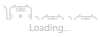
An example of a mood board that explores color and gradients.
一个探索颜色和渐变的心境板的例子
Style Tiles
风格瓷片
Once a general brand direction is defined, style tiles can be useful for exploring several variations in more detail. The concept of style tiles was introduced by Samantha Warren8, who describes them as “a design deliverable consisting of fonts, colors and interface elements that communicate the essence of a visual brand for the web.”9
一旦定义好了初步的品牌方向,风格瓷片有助于探索更为细节上的调整。风格瓷片的概念是由SamanthaWarren8提出的,他将其描述为“一种由字体、颜色和界面元素组成的设计交付品,传达了网络视觉品牌的本质。”
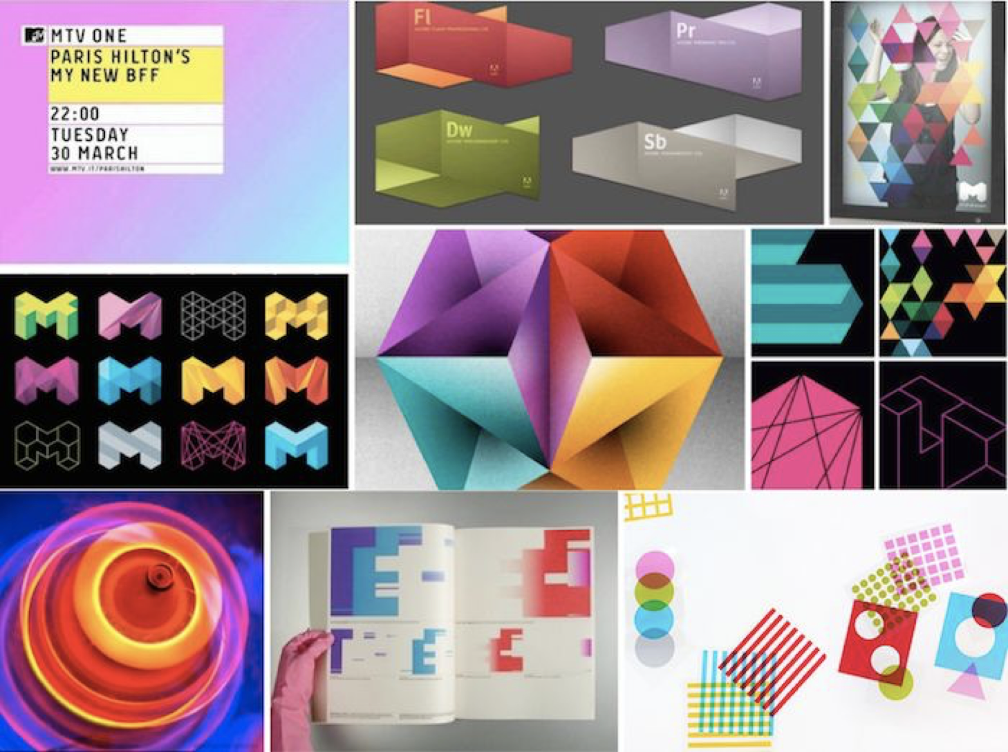
The Washington Examiner 2012 Campaign Site.
华盛顿检查者报的2012竞选网站
Like mood boards, style tiles can provide valuable discussion points with users and stakeholders, and gauge their initial reactions towards specific design directions. Comparing and contrasting style tiles against each other can help you make a choice of one direction over the other.
与意境板一样,风格瓷片可以为用户和涉众提供有价值的讨论点,并评估他们对与特定设计方案的最初反应。比较和对照不同风格的风格瓷片可以帮助你选择一个其中一个方案。
Element Collages
元素拼贴画
Riffing on style tiles, Dan Mall10 suggested the idea of an element collage: an assembly of interface pieces that explore how branding works in the interface. As a design deliverable, they can feel more concrete and tangible than style tiles; yet element collages don’t come with quite as many expectations as complete visual mock-ups. Element collages explore not only a general brand direction but how brand is expressed through the interface.
为了能够快速浏览风格瓷片,DanMall 10提出了元素拼贴画的概念:用于探索品牌在界面中是如何工作的界面元素的集合。作为一个可实操的设计方法,相对于风格瓷片而言他们可以感觉到更具体和有形;当然了,相对于高保真的可交互原型来说,元素拼贴画在体验上还是有差距的。元素拼贴画不仅探索通常所指的品牌方向,更用来探索如何通过界面表达品牌。
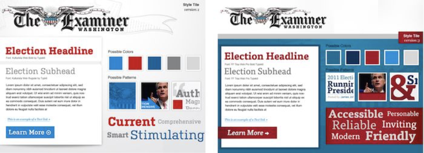
Element collage for RIF.
RIF的元素拼贴画
The differences between these techniques aren’t always obvious, and people use them interchangeably. For me, the distinction lies in their relative fidelity. Mood boards are looser and more open; they combine existing materials from various sources to create a certain visual feel. Style tiles and element collages are more focused on a specific product and the practical application of patterns in the interface. Element collages provide the highest level of fidelity and can be used as a starting point to transition into full comps.
这些技巧之间的差异并不总是显而易见的,人们可以交叉运用它们。对我来说,区别在于他们之间的相互精准程度。情绪板更宽松,也更开放;它们将市面上常见的各种材料结合起来,创造出一种特定的视觉感受。风格瓷片和元素拼贴画更侧重于特定产品和应用界面模式。元素拼贴画提供最高级别的保真度,并可视为转向正式开发的标志。
Iteration And Refinement
迭代更新
The process of evolving the styles continues when they’re integrated into the product. Trying out the brand in a more realistic setting of the interface, with modules and interactions, often results in refinement of both perceptual and functional patterns. This is typically an iterative process, where the patterns influence one another, until a design language starts taking shape.
当这些样式搭建出产品后,样式的的发展过程仍会持续。在更为真实的环境中,通过模块以及交互的方式,在界面中传达出品牌形象。在一个更真实的环境中,结合模块和互动的方式,将品牌形象通过界面的形式表现出来。进而会有助于知觉模式和功能模式的更新。模式之间相互影响通常是一个迭代的过程,直到设计语言开始成形。
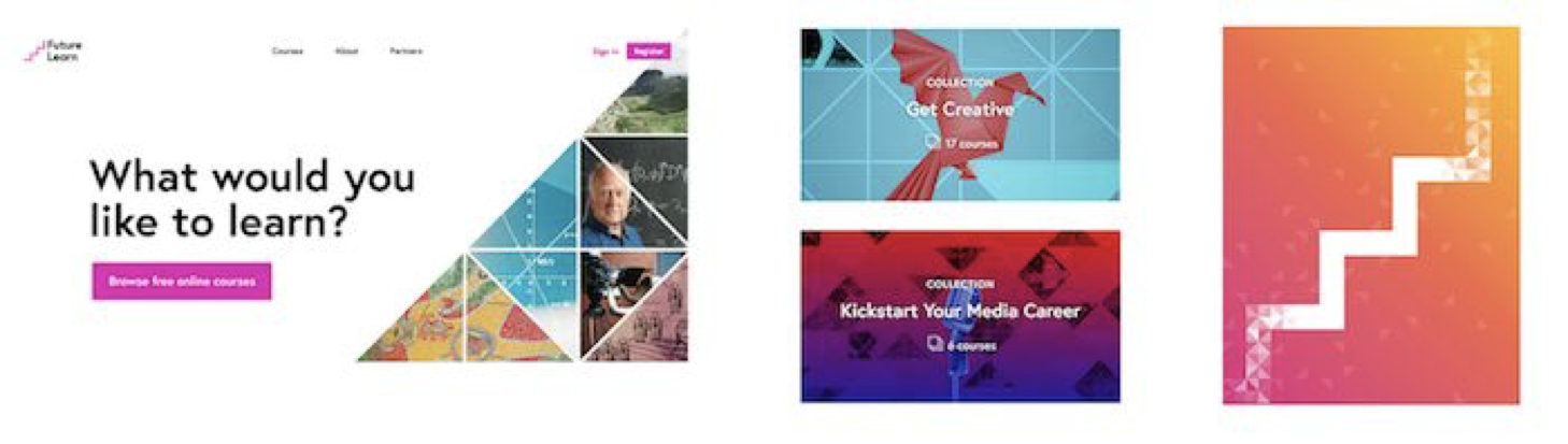
Let’s take a look at how FutureLearn’s styles were developed. The image below shows the initial explorations by Wolff Olins11 for the FutureLearn brand. While they capture some of the personality FutureLearn was trying to project (minimal, bold, bright, positive, celebratory), there’s a difference between the initial direction and how it evolved over time.
让我们来看看FutureLearn(Futurelearn)的风格是如何形成的。下图展示了沃尔夫·奥林11对FutureLearn品牌的初步探索。他们提取了一些FuturLean的特性并尝试应用到项目之中(极简,直观,鼓励、愉悦、积极、鼓励),并且经过几次演进版本会与初始版本有区别。
Initial brand explorations for FutureLearn.
FutureLearn的初步品牌探索。
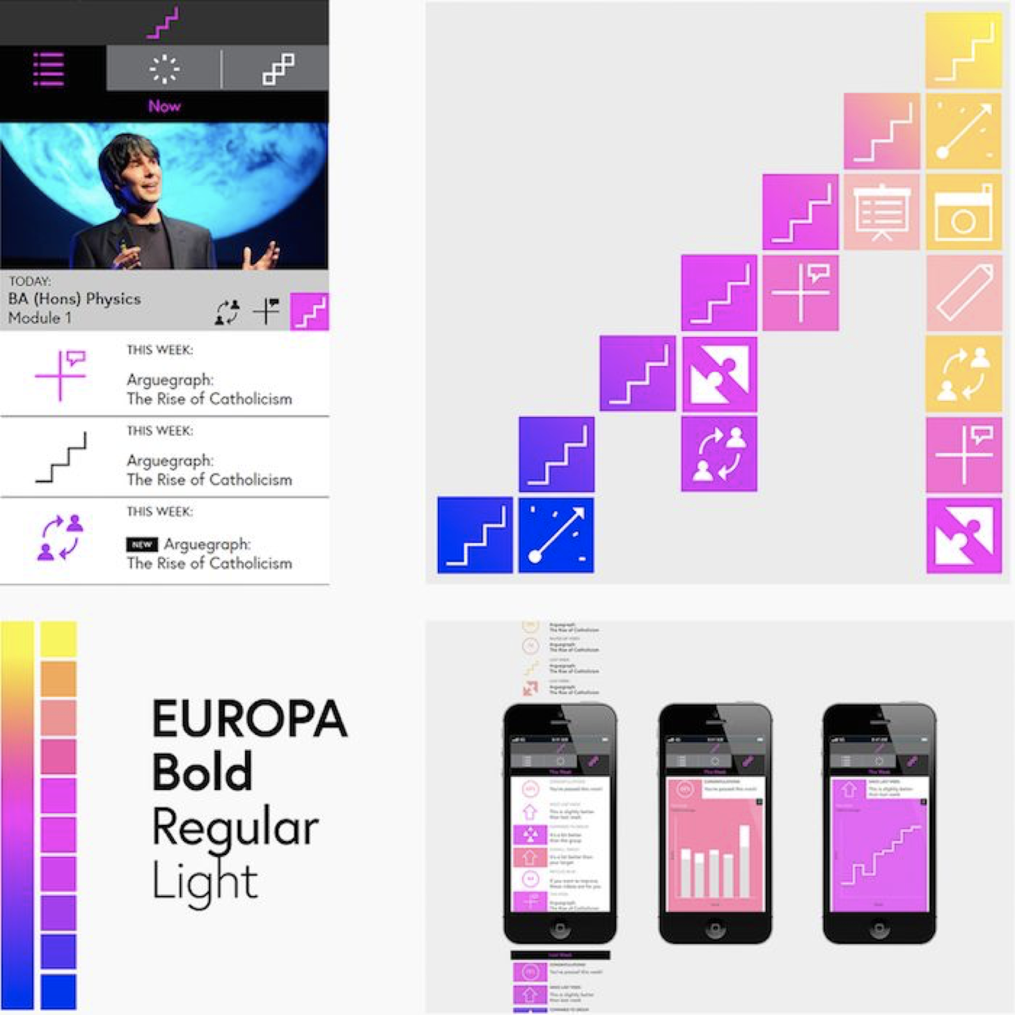
Here is how the core perceptual patterns looked a few months later, after the visuals were passed on to the internal design team at FutureLearn:
以下是内部设计团队在接管视觉规范的部分,几个月之后核心知觉模式的样子:
Element collage for FutureLearn.
FutureLearn的元素拼贴画
By applying them to the actual context they were going to live in, the patterns had to become more grounded, more specific and more practical. Here’s how FutureLearn’s iconography evolved from initial concepts to the designs you can see on the site today:
若想将模式应用到真实的场景中,这些模式必须变得更有根据、更具体和更实用。以下是“FutureLearn”的图表库是如何从最初的概念发展到今天你在网站上看到的设计作品:
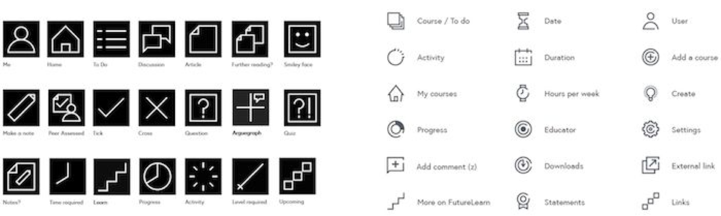
Initial icon designs by Wolff Olins (left) and how they were evolved by FutureLearn’s design team (right). The gaps in the icons signify that a learning process is never complete.
由沃尔夫·奥林斯设计的最初图标方案(左)和FutureLearn的设计团队迭代后的设计方案(右)。图标中的开口寓意着学习过程继续进行中。
In the conceptual phase of brand development, it was important to go broad and big, and not worry about every detail. But when we started applying the concepts, they had to be refined, so they felt appropriate for the new environment they occupied. The focus shifted from an open exploration to refinement and consistency.
在品牌发展的概念阶段,重点在于大胆创新,而不是纠结细节。但是当我们开始实际应用这些概念时,它们必须被完善,这样才会让他们适应所处的新环境。重点从开放式探索转向迭代更新和保持一致。
At this stage the challenge is to continue evolving the brand, while keeping the patterns consistent. As Lucy Blackwell, creative director at FutureLearn noted: “When you’re fully focused on consistency, some of the important subtleties of what makes a product feel a certain way can be lost.”
在这个阶段的挑战是继续发展品牌,同时保持模式的一致性。正如FutureLearn的创意总监露西·布莱克韦尔(Lucy Blackwell)所言:“当你全神贯注于一致性时,能够丢失掉能够传达出产品特性的关键细节。”
Balancing Brand with Consistency
平衡品牌与一致性。
Just as introducing too many exceptions can weaken a brand, too much focus on consistency can also stifle it. Paradoxically, making design perfectly consistent doesn’t guarantee it’s going to be “on brand.” Sometimes it can have the opposite effect — there’s a fine line between consistency and uniformity.
就像引入太多的例外情况会削弱一个品牌一样,过分关注一致性也会扼杀品牌。矛盾的是,使设计完全一致并不能保证它将是成为“品牌”。有时它会产生相反的效果 -- 统一和一致性之间有着一个平衡点。
With seven designers working in several streams, at FutureLearn we had to set up processes that allowed us to focus on reusability and utility. But in some areas of the site we found ourselves following them too closely, sometimes at the cost of weakening the brand. Here’s how the courses page has changed over time:
FutureLearn的七个设计师在经过几轮的攻坚之后,我们建立起了一套能够使我们能够专注于可重用性和实用性的流程。但在网站的某些领域,我们发现我们过于遵守它,以至于付出了品牌被削弱的代价。以下是课程页面演变的过程:
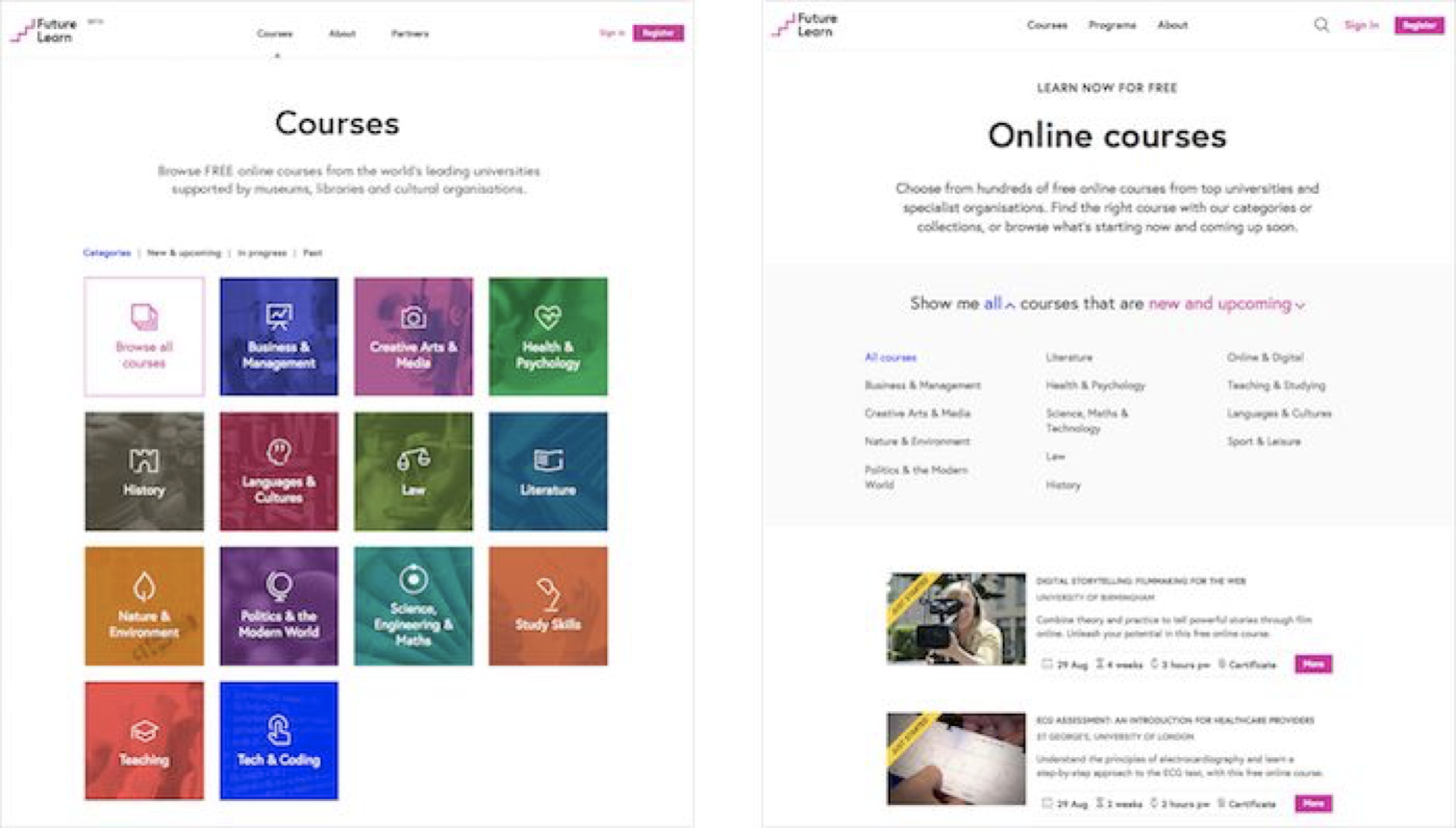 FutureLearn courses page in 2015 and late 2016.
FutureLearn在2015和2016年底的课程页面
It made sense to make the design more practical, clean and organized. It was also a positive change for SEO and metrics, and was more consistent with other pages on the site. But at the same time we felt that in the process some of the visual distinctiveness present at the beginning was lost. While we accepted this change in some areas of the site, in others — particularly in branded marketing campaigns — we started experimenting more, in the attempt to make a stronger brand statement.
让设计更实用、更干净、更有条理是有意义的。同时对于搜索引擎优化和度量有积极的影响,并有助于与网站中其他网页保持一致。但与此同时,我们也感觉到,在这个过程中,最初出现的一些视觉亮点消失了。虽然我们在网站的某些板块接受了这一变化,但在其他领域--特别是在品牌营销活动中--我们开始进行更多的试验,尝试打造更为强大的品牌形象。
If a design system only prioritizes perfect consistency, it can become generic and rigid. Evolving perceptual patterns requires room outside of the boundaries of the system, and designers should be actively encouraged to explore. A good design system strikes a balance between consistency and creative expression of the brand.
如果设计系统只优先考虑完美的一致性,它就会变得平庸和代办。不断进化的感知模式需要系统边界之外的发挥空间,应该积极鼓励设计者进行探索。一个好的设计系统会在品牌的一致性和创造性表达之间取得平衡。
A Note on Signature Moments
关于经典时刻
Perceptual patterns can be concentrated in the smallest details. In his book Microinteractions12, Dan Saffer coined the term “signature moments” — small interactions that become product differentiators, such as “an elegant ‘loading’ animation or a catchy sound (‘You’ve got mail!’).” Signature moments are especially powerful when they have meaning or a story behind them. For example, the subtle ripple effect on TED’s play button was inspired by the iconic drop animation of their videos’ intros.
感知模式可以体现在最小的细节上。丹·萨弗(Dan Saffer)在他的书“微互动”(MicroInteraction 12)中创造了“经典时刻”这个词—微互动有助于产品的差异化,比如“优雅的‘加载’动画或吸引人的声音(‘你收到了邮件!’)”。当“签名时刻”背后有特别的意义或故事时,它就显得特别有力量。例如,TED的Play按钮的微妙的涟漪效应的灵感来自于他们的视频介绍中标志性的跌落动效。

TED’s drop animation of their videos’ intros mirrored in the ripple effect on the video play button.
TED视频介绍中掉落动效被体现在了视频播放按钮的涟漪效果之上
In digital products, signature moments are not always seen as a requirement, and some teams struggle to prioritize them.13 But it’s the small details that can add an additional layer of depth and meaning to the experience. In our efforts to systemize and structure design it’s important to be conscious of the details that make something feel distinct. In a design system, there always needs to be space to nurture and evolve those moments.
在数字产品中,不会经常出现签名时刻这个需求,有些团队很难确定它们的优先级。13但是,但是这些小细节能为体验增加更多的深度和意义。在我们的系统化和结构设计的努力,重要的是要意识到细节,使感觉不同的东西。在设计系统中,总是需要有空间来培育和发展这些时刻。
Small-Scale Experiments
小范围实验
How can we make a space for creative explorations? And how do we then fold the new styles into the system? At FutureLearn, we found that it was most effective to experiment on a small scale first. If some of the elements worked well, we’d gradually integrate them into other parts of the interface.
我们如何打造创意探索的空间呢?以及我们如何将新的样式融入到设计系统里?在futurelearn,我们发现最有效的办法就是在小范围先测试,如果一些元素有效果,我们将他们逐渐整合到界面之中。
For example, we felt that the purely functional toggle button lacked the feel of celebration and accomplishment when learners completed a step. It was replaced with a circular style, a bouncy animation and a tick icon popping up.
例如,当用户完成一个学习阶段的时候有一个进度按钮,我们觉得纯粹的功能切换按钮缺乏庆祝感和成就感。取而代之的一个圆形、有弹跳的动画和一个对号图标的按钮。
Original progress button (left) and redesigned button (right) on FutureLearn.
Futurelearn中的原进度按钮(左)和重新设计按钮(右)
While the new button received positive feedback from our learners, it didn’t feel like part of the system until we started echoing the circular pattern, the bouncy animation and the ticks in other areas of the site. Without these additions, the element felt disconnected.
虽然新的按钮从我们的学习者那里得到了积极的反馈,但直到我们开始在网站的其他地方呼应圆形图案、有弹跳的动画和对号图标时,它才感觉到它是系统的一部分。如果没有这些元素的添加,元素之间就会失去了关联性。
On occasion we tried out new patterns on promotional areas, such as the home page or a campaign site. FutureLearn’s brand used to employ primarily square shapes. During a home page redesign, we introduced a triangle pattern. It was strengthened when other designers started applying it in other areas, such as image styles and certificate designs.
有一次,我们促销区域尝试新的模式,比如主页或活动网站。Futurelearn过去主要采用方形作为主推的品牌形象。在一次主页的重新设计过程中,我们引入了一个三角形图案。当其他设计师开始将它应用在其他领域(比如图像样式和证书设计),三角形的应用得到了巩固。
Initial experiments with triangles on the home page started off quite flat (left), but were given a new twist by other designers who took the pattern and applied it to their projects.
在最初尝试将三角形图案运用到首页上时,最初的效果是相当扁平化的 (左),但其他设计师将此模式应用到他们的项目中带来了新的转折
While experimenting with the triangle patterns, we were aware that they were outside of FutureLearn’s typical square aesthetic, but wanted to give them a try to see what would happen. We learned later that while triangles worked with the brand, they had to be used sparingly and only as a visual enhancement in the discovery and marketing areas of the site, not on the in-course learning experience pages.
在我们尝试三角形图案的过程中,我们意识到它们不在FutureLearn典型的方形美学范围之内,但我们仍然想尝试一下,看看会发生什么。我们意识到,三角形图案更适合在以网站中探索和营销板块而不是课程学习页面,并且只能于结合品牌形象相结合,小范围的应用用以提升视觉效果。
When exploring new styles, try them out on a small area of the site. Be aware of what you’re doing differently, the patterns that are outside of the system, and the reasons for trying them. If they work, gradually fold them into the system by applying them in other areas of the site. Be conscious of the role they play. For FutureLearn, triangles are used to create a dynamic effect; circles are used as a positive reassurance of progress, typically in combination with a tick.
当探索新的风格的过程中,在网站中小范围的应用。注意你正在对设计系统之外的模式做哪些差异化尝试,以及尝试这样做的缘由是什么。如果它们起作用,通过将它们应用于站点的其他区域,逐步将它们融入到设计系统中。要意识到他们所扮演的角色。对于futurelearn,三角形被用来创造一个动态的效果;圆圈被用来作为进步的积极反馈,通常与对号结合在一起使用。
Balancing Brand with Business Requirements
平衡品牌与业务需求
Because perceptual patterns are sometimes seen merely as styling or decoration, changing them can be less contentious than, say, updating the flow of an interaction. As a result, ad hoc business requirements can lead to introducing of elements that don't sit comfortably with the brand. For example, we wanted to let our learners know when new courses were starting, so we added yellow banners to the course images.
因为感知模式有时仅仅被看作是造型或装饰,改变它们可能没有更新交互流程那么有争议。因此,定制化的的商务需求可能导致引入与品牌不协调的元素。例如,我们想让我们的学员知道新的课程何时开始,所以我们在课程图像中添加了黄色的横幅。
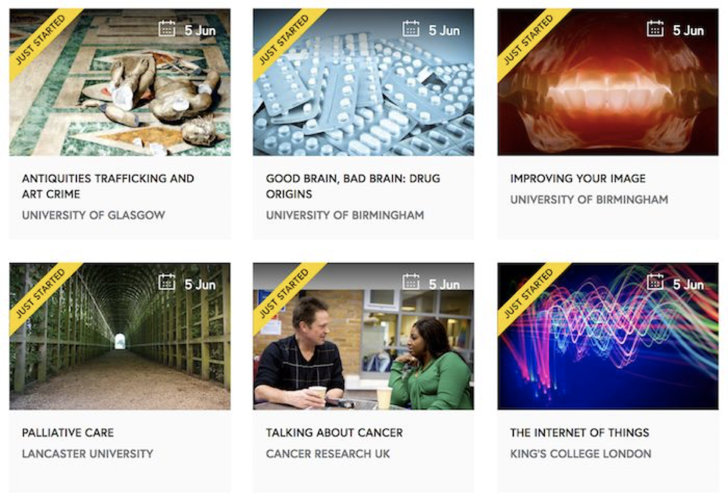
“Just started” banner on FutureLearn for highlighting recently started courses.
在“FutureLearn”上的横幅“刚刚开始”,用于强调最近更新的课程
Even though the banner wasn’t perfectly on brand, it wasn’t a problem since only a few courses were running at the time. What we didn’t realize was how many more courses would start within a few months. When it happened, the balance of the course module shifted from feeling like a highlight, to appearing a bit garish and sales-oriented, which is a feeling we try to avoid in the FutureLearn brand. Again, because this was seen as part of styling, it was hard to prioritize and took a long time to address.
尽管这条横幅与品牌上并不完美匹配,但在当时只有几门上线课程的情况下,这并不是什么问题。我们没有意识到的是未来的几个月还会有多少课程开课。当那个时候,课程模块的天平从给人以提醒,转而倾向给人感觉有点花哨和销售促销的感觉,这是我们在FutureLearn品牌极力避免出现的情况。同样,因为这被视为样式的一部分,所以很难确定轻重缓急,而且花了很长时间来解决。
No matter how much we guard the brand, these things will happen — new requirements demand custom patterns and one-off tweaks. If we’re not conscious of them, such exceptions can dilute or weaken the brand.
无论我们如何保护品牌,要求定制化模式和特例调整的新需求总会不时的出现。如果我们没有对他们保持警惕,类似于这样例外将会稀释或削弱品牌。
Signature Patterns: A Team Exercise
经典特征:团队练习
Sometimes even a small change can alter perception. At FutureLearn, we once almost replaced the square shapes in the course progress module with circles, before we noticed that doing so would completely change the feel of the interface. To control how something feels, you need to understand the exact patterns that influence it.
有时,即使是小小的改变也能改变人们的看法。在“FutureLearn”,我们曾经把课程进度模块中几乎所有的方形元素替换成了圆形,然后我们注意到这样做会完全改变界面的感觉。要控制事物传达给人的感觉,你需要了解影响它的关键元素。
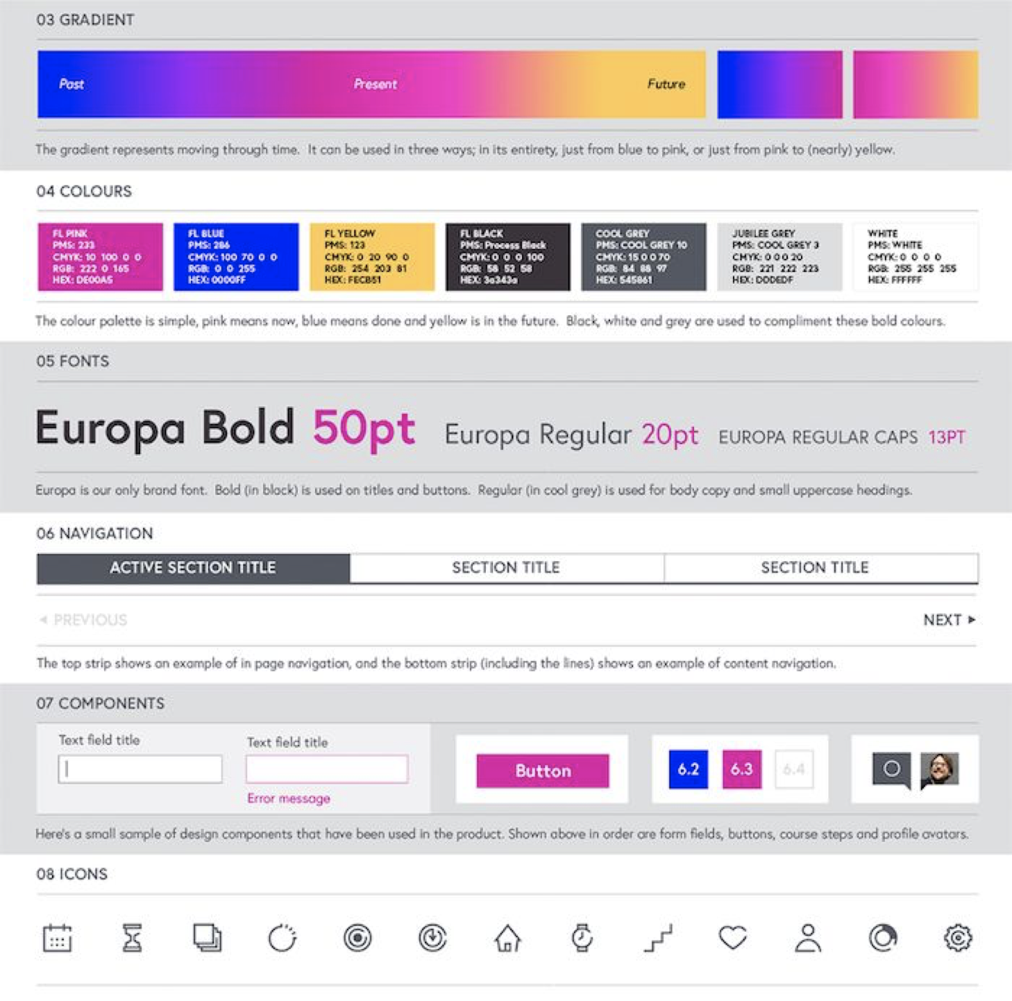
In your team, try running a quick exercise. Ask each person to write down the most distinct perceptual patterns for your product. Encourage people to look beyond the building blocks such as color palette and typeface, and instead think of high-level principles, combinations and treatments that are specific to your brand. Think not only about the elements, but the meaning behind them — the images they portray and the stories they tell. In FutureLearn’s interface, some of those patterns are:
在你的团队中,试着做一个快速练习。让每个人为你的产品写下最有识别度的感知模式。鼓励大家透过配色版和字体样式等页面元素看清本质,并且思考你的品牌特有的重要原则、组合和处理方法。不仅要考虑这些元素本身,还要考虑它们背后的意义--它们所描绘的形象和它们所讲述的故事。在FutureLearn的界面中,包含了以下模式:
•Positive and encouraging tone of voice
积极和鼓舞人心的语气。
•Primarily white color palette with pink accents
·以白色为主色,粉红色为点缀色的配色方案。
•Generous white space
大量的留白。
•Generally large type size with a focus on readability
·广泛采用大号字体,注重可读性。
•High-contrast typography with proportionally large headings
高对比度的大标题排版方式。
•Vibrant pink to blue gradient
·高饱和度的粉红色到蓝色的渐变。
•Pink to blue subtle hover interactions
·粉红到蓝色的悬浮交互效果。
•1px light-gray strokes
·1px浅灰色线条。
•1px square icons with a “break”
·带有1px“断点”的正方形图标
•Mostly square and occasionally circular shapes, triangles in promotional areas
·大部分采用方形元素,偶尔为圆形元素,活动区采用三角形元素。
Similarly to the exercise with finding shared themes in you design principles described in the second chapter, comparing your team’s thoughts can surface different ways in which you perceive your brand. The qualities might be vague and indistinct at first but they’re a great basis for discussions. Reaching a shared understanding of the most distinct perceptual patterns is a useful starting point for your future work on systemizing them.14
类似于第二章中描述的在设计原则中找到共同主题的练习,对比团队的想法可以让你以不同的方式看待自己的品牌。起初,这些特质可能含糊不清,但它们为讨论打下一个很好的基础。对于最独特的感知模式达成共同理解,将对后续系统化感知模式开了一个好头。
Patterns and principles are an important part of a design system. But, of course, if you work in a team, they’re not enough. A selection of words and rules doesn’t make a language. It only starts becoming a language when you attribute meaning to those words and other people start sharing this meaning.
模式和原则是设计系统的重要组成部分。但是,当然,如果你在一个团队中工作,他们是不够的。单词和规则的选择并不能构成一种语言。只有当你给这些词赋予意义,而其他人开始分享这些意义时,它才开始成为一种语言。
——
1.This way of thinking can make visiting places a whole different experience. Be it a coffee shop, a new city, or a picnic spot, I like to think about how a place feels and then try to determine some of the patterns that combine to create that atmosphere.
这种思维方式可以使参观场所成为一种完全不同的体验。无论是咖啡店,第一次去的城市,还是野餐的地方,我喜欢思考一个地方的给人感觉,然后尝试找出搭配创造的这个气氛的模式。
2.It's Ulysses, in case you wanted to know.
Ulysses APP这款写作工具可以作为你进行产品体验练习的案例(PS.这里已经有一篇可以参考的Ulysses深度体验文献:https://www.softwarehow.com/ulysses-app-review/)
3.Spotify’s vision “The right music for every moment” and their design principle “emotive” are inline with the feel created through perceptual patterns.
Spotify的远景:“每时每刻都听适合音乐”及其设计原则“情绪化”与通过感知模式创造的感觉是一致的。
4.These screenshots were taken in March 2017. Interestingly, a couple of weeks later Vox changed their design to a denser newspaper-like feel, to come across as more “credible and smart”.
这些截图是在2017年3月收集的。有趣的是,几周后,Vox将他们的设计改成了一种更密集的报纸感觉,让人觉得他们更“可信和聪明”。可浏览以下网址了解更多
Behind Vox.com’s Homepage Refresh
5.https://smashed.by/designingemotion
6.Designing for Emotion by Aarron Walter (see also “Personality in Design”)
11.https://www.wolffolins.com/
12.https://microinteractions.com/
13.For great practical advice on designing microinteractions and integrating them into a product, see Microinteractions: Designing with Details by Dan Saffer.关于设计微交互并将其集成到产品中的重要实用建议,请参见微交互:Dan Saffer的详细设计。
14.In chapter 9 we’ll talk about conducting an interface inventory on perceptual patterns and integrating them into the system.在第9章中,我们将讨论如何对感知模式进行界面清单,并将其集成到系统中。

为你推荐 · 训练营(全勤打卡报名费全额返累计全额返用户133,637人)

关注10
文章


- 扫码下载APP

- 官方微信


暂无评论
违反法律法规
侵犯个人权益
有害网站环境